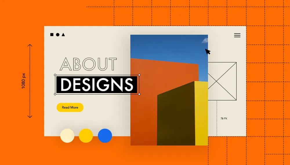
Web Design Matters: How to Create Beautiful and Functional Websites
In today’s digital era, including a strong online existence is crucial for corporations and individuals alike. A well-designed website serves as the face of your brand and plays a pivotal role in attracting and engaging users. It is not just about aesthetics but also about creating a functional and user-friendly platform. In this article, we will delve into the significance of web design and explore effective strategies to create beautiful and functional websites that stand out from the competition.

The Importance of Web Design
In a highly competitive online landscape, web design can make or break your website’s success. A visually appealing design instantly captures the attention of visitors, leaving a lasting impression. It sets the tone for your brand and conveys professionalism, credibility, and trustworthiness. Moreover, an intuitive and well-structured layout enhances user experience, leading to higher engagement, longer visit durations, and increased conversion rates.
Understanding User Experience (UX)
User experience (UX) is a fundamental aspect of web design that focuses on meeting the needs and expectations of website visitors. By creating a seamless and intuitive browsing experience, you can keep users engaged and encourage them to explore further. Elements such as easy navigation, clear call-to-action buttons, fast loading speed, and mobile responsiveness contribute to a positive UX.
Responsive Design for Mobile Devices
With the majority of internet users accessing websites through mobile devices, responsive design has become paramount. Ensuring that your website adapts seamlessly to different screen sizes and resolutions enhances user experience across all devices. Mobile-friendly websites are not only favored by search engines but also provide a better experience for on-the-go users, leading to increased engagement and conversions.
Color Psychology and Branding
Colors evoke emotions and can significantly impact how visitors perceive your brand. By understanding color psychology, you can strategically choose colors that align with your brand’s identity and message. Harmonious color schemes create a visually appealing and cohesive design, enhancing the overall user experience. Consistency in branding, such as using the same color palette and fonts throughout the website, reinforces brand recognition.
Visual Hierarchy and Typography
Visual hierarchy plays a crucial role in guiding visitors’ attention and prioritizing content elements. By using different font sizes, colors, and spacing, you can highlight important information and create a sense of order. Clear and legible typography enhances readability, ensuring that users can easily consume your content. Avoid clutter and excessive use of fonts, as they can lead to confusion and distract from the main message.
Optimizing Website Speed
In today’s fast-paced world, users anticipate websites to crowd quickly. Slow-loading websites not only discourage visitors but even harm hunt engine scales. Optimizing website speed involves techniques such as compressing images, minifying code, utilizing caching mechanisms, and choosing a reliable hosting provider. A fast-loading website not only improves user experience but also positively affects SEO performance.
Intuitive Navigation and Site Structure
Easy and intuitive navigation is crucial for helping users find the information they need efficiently. A clear and well-organized site structure enhances usability and ensures that visitors can navigate through your website seamlessly. Utilize logical menu structures, breadcrumbs, and internal linking to guide users to relevant pages and encourage them to explore further.
Incorporating Engaging Visual Content
Images, videos, infographics, and other visual elements can significantly enhance user engagement and convey information more effectively. Compelling visuals break up text-heavy content and make it more digestible. However, it is important to optimize images for web use to prevent them from negatively impacting page load times. Additionally, ensure that any visual content used is relevant and aligns with your brand identity.
Keep your design balanced.
Credit is all about ensuring that your design accomplishes not tip to one side or the different. It is like the balance of importance in achieving consonance or asymmetry.
Look at the dog in the title graphic of Khoi Vinh’s Removal website below. I took this sample from The Principles of Beautiful Web Design by Jason Beaird. Jason files out how the cross to the request creates up for the counted visual weight that the dog supplies on the left. It is a miniature but not a minor detail. See for yourself by suppressing the cross with your hand. This is what we call asymmetrical harmony, and this is what balance is about. If you’re not aware of how you lay something to release, the procedure will become unstable rather fast. You can exploit the visual weight of a design in multiple ways, such as with paint, size, and the acquisition or removal of parts. If you were to make the cross, say, a vibrant orange, it would become heavier and maybe throw the layout off credit again. Achieving asymmetrical proportion is an especially mild matter that takes time to fine-tune and a moderately trained eye to pull off.
Here below is another illustration of proportional proportion, this one by The First Twenty. Although the heading representation is asymmetrically group (can you spot how it’s done?), the remainder of the web lower down has proportional cues. Asymmetrical acclaim might be more difficult to pull off, but it manages to make a form more active.
You will find that every method you think looks right has a well-constructed balance underlying it. And every technique featured here slices high on each of the seven principles we discuss. So take a minute to scroll awake and down and see for yourself if they all part muster.
Compartmentalize your design by using grids.
The idea of grids is closely connected to that of balance. Grids are a series of horizontal and perpendicular monarchs that help you “class” a design. Think of columns. Queues improve readability, completing a page’s content more comfortable to absorb. Spacing and the use of the Rule of Thirds (or a similar Golden Ratio) make everything more comfortable for the eye. The Rule of Thirds and Golden Ratio report for why sidebars, for example, are usually about a third of the width of the carrier and why the main range area is roughly equal to the design’s width separated by 1.62 (equalling phi in the calculation). We won’t get into why this is, but it does seem to hold in training. It is also why the issue in professionally taken photos is usually placed not in the center but at the intersection of an invented nine-square grid (three by three, with two prostrate and two vertical lines).
Pick two or three base shades at most for your plan.
What if you switched the ground red on The First Twenty website (above) to lime green? Would it look good? Numerous likely not. Because it does not belong to the same color palette (and of course lime green isn’t the most comfortable color to work with). Websites such as ColourLovers live for a cause. You can’t simply pick your colors from Rambo-style, gun lighting. Some colors go well jointly, others don’t. A lot of theories on shades and their combinations exist, including conventions on monochrome and contrasting schemes, but a lot reaches down to common sense and having a feel for it.
Find out for yourself what works jointly. Soak up as numerous website designs as possible, such as those featured on any of the numerous CSS showcase websites (like Best Web Gallery), to obtain a feel for how pigments interact with each other. Pick two or three ground shades at most for your strategy, and then use tints (which are lighter, mixed with white) and shades (which are darker, mixed with black) of these ground colors to expand the palette where necessary.
Choosing nice colors is as essential as picking the correct colors (that is, the right shades for the job). A Web design for a cozy small restaurant would do well with “loamy” tones: reds, browns, etc. Of practice, there is no such thing as a surefire recipe. Every color ships out a statement, and it is up to you to get the news right. Bence Kucsan’s website has a color system style of his own. It’s mainly monochrome (tints and shades of a single color) and achromatic (black and white) with a shade (red) to stand out The black and white transfers chic and experienced, while the red adds the spice that causes certain elements to stand out and supports the design from studying dull; of course, more than just red completes this design interesting. By the way, one company in certain popularized this technique.
Try to make the pictures go well together.
Okay, great design doesn’t require flowery illustrations. But poor graphics will break a design. Graphics add to the graphic information. Websites like WebDesigner Wall have unique illustrations, while others are understated.
Tim van Damme uses only a handful of photos on his website Max Voltar, but he performs them with the greatest view and respect. A non-intrusive location photo and a cultured crown stand two of the graphics. Visually, they are not overly special, but they all add to the countenance and feel of the website, and nowhere is one out of business.
For some while now, Max Voltar has had a different design from the one shown overhead. But for the two months that this one lived online, it stood easily one of my favorites. Because of this and because its use of graphics is so good, I liked it over the latest version.
Rogie King’s Komodo Media is a lot more useful graphics-heavy, and flawlessly executed from both a technical and thematic perspective. ou may not live a great illustrator or photog, but that doesn’t suggest you can’t put great graphics on your website. Some rudimentary Photoshop skills, perhaps some stock photos, and amazing flavor are all you require. Try to create the graphics go well jointly, and make sure they embody the style you are seeking for. We are not all gifted with identical natural ability, though. You can pick up some items by understanding from others, but sometimes you just have to pick the style that fits you agreeably (like a clean tone if you live not the greatest of illustrators).


